Monday, 30 November 2015

sketch book development


I felt at a lose end after deciding that I'm not creating a comic book. I come to deciding to make some nice prints for my final submission. But I had it in my mind that I was going to make a publication. 
I feel if I make. Some nice print that I'm just playing it safe and not challenging my self. As I'm the best person who know most about my work and how I create things I know I can have one drawing Nicky crafted and ready for a screen in one day. If I was to do 5 that's 5 days... Feels a bit of a cop out, I know i explained before that I wouldn't have the time to crate a comic book in screen print and this might sound like a contradiction but for that I would have had to thumb nail each and every panel and mess around with composition on every panel...I planned that out to fit my times table, and the level of detail I wanted it to have wouldn't come out on the screens, but it's not just that I don't...like the look of screen printed comics. So it's not a contradiction.

So I felt I was just settling for screens. The following Thursday we had a briefing/presentation at colours may vary...with in that there was a talk about how Yorkshire and Leeds focused images sell better, this inspired me to maybe bring that into my work...my abandoned locations could be places of Yorkshire or Leeds. So this inspired me loads but still wasn't too excited about prints. 

After the talk with the owners of colours may vary, I had a chat with Fred about the books he had bought from there. He showed me a book that he said I would like, the book was 

Ugo Gattoni’s illustrated London bicycle race a concertina design book, and Fred was right (again) I did like it, it inspired me, gave me the idea that I can create a concertina for my final piece, a little more challenging than a few prints. It's something new and different design from anything Iv worked on before. 


                                        What a publication! 

a new publication: 
a concertina book this images of points of Leeds city centre, the locations will be abandoned and have a postapocalyptic feel to them. 

One idea was to make it just as complicated and interesting as the book that inspired it. Another idea was to create single pages that run along side each other but interesting by the composition and lay out of each page.

I decided to go with the second idea, so I wasn't completely ripping of the style of the book. Plus it's more me if I made images that played around with the composition.
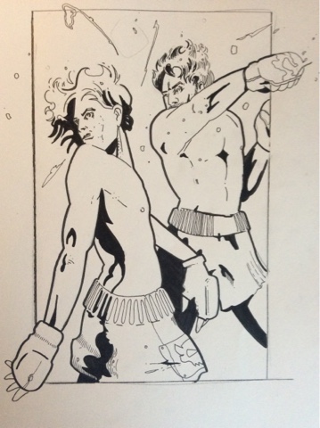
Sketch book work.


These might not make much sense to you but believe it or not this makes sense in my head. The blue lines show the composition of the page. Shows how deep the page goes and explained the lay out. I printed these digital thumbnails out so I can cut them up and add notes to this helps me understand the form and lay out, the better I understand the piece the easier I can work with it if I need to adapt the concertina.


Sunday, 29 November 2015

Illustration Friday


illustration friday 


this weeks topic is punch 

All ready I'm thinking of ways I can make this fit my style. I think it's rather fitting because of the comic style but I don't want to to anything expected I want to play around with composition and angles of the frame with this one I want the skills and the composition to be the impact not the punch. Again I'm going to come at thins in pencil and finish of with a digital ending. 


To do list.

Research inspiration - 1 hour
Thumbnails              -  1 hour
Roughs.                   - 30 mins
Page work.              - 2 hours 
Digital                      - 2 hours 

I left this project so latest minuet. So the above action plan went down the drain. I still did all of that but in the space of two hours. I got so lost in other projects this week I forgot about this project. 

So here's my quick and shame full attempt at illustration Friday.

Thumbnail ideas.

Even though I said I wanted to take another approach and don't want to be all cliche about this, I had to. I didn't have the time to experiment and get stuck in on it. So a cliche punch it is.


Above. I started to play around with other characters try to aim this brief at an audiance. I drew quick thumb nails of mario hitting the mooshroom like the old game boy game. I then drew the Star Wars scene were solo says punch it chewie. These would have worked and maybe if not better than the chosen one I went with but I feel that at the end of this I was a set that go together.
So maybe 10 illustrations that work as a set.

So I chose the ring thumbnail. I think positioning was key on this one, movement and the were abouts of the characters need to spot on to make this image work. So I have a few attempts to experiment that. I couldn't do loads because the clock was ticking on the dead line.


Above. My final rough for the illustration 

Ink stage.


Really not happy with this out come but Iv only my self to blame for leaving my self with a short space of time to create an illustration. The boxer in the back ground is well out of whack. Too much body showing for his position. His head should be more to the right and hidden. Just horrible judgment...and rushed.


Now it's finished. I feel slightly better out it just because it looks like part of the set now but still makes me sick to see that diformed man in the back. When I look at him I hear a very old British posh accent " I say my good man... Take this to the end of your chin " 


Saturday, 28 November 2015

Responsive- spectrum development

To start the work on this brief I decided to go back to the brief and read it over so I understand the entire thing. Afterwords I realised Spectrum is pretty open Brief. The only thing to understand and get your head around is that requirements of it such as file type and image size and the codes for the topic you enter.

File type tiff file - 400 dpi 9" 12" 

Print Submissions: Submit proofs, tear sheets, color photographic prints, clear photocopies, laser prints or other reasonably high-resolution, computer-generated prints. Recommended sizes are no smaller than 8.5" x 11" and no larger than 12" x 18", although all sizes are accepted. No original art, slides or transparencies will be accepted for judging. Do not submit complete books, comics, graphic novels or articles as a single entry. One Form "A" should accompany your entries. A Form "B" (or a facsimile) must be taped to the back of each entry. If the entry is part of a series, a Form "B" must be taped to the back of each piece. Credits in the Spectrum annual will be taken from Forms "A" and "B." Spelling, credits and addresses must be complete and legible.
Digital Submissions: Visit the Spectrum online page to enter your submissions online and for digital file specifications.
Entries must be postmarked and prepaid, with all appropriate forms and entry fees, and sent to Flesk Publications/Spectrum Fantastic Art, 2871 Mission Street, Santa Cruz, CA 95060, U.S.A., no later than January 25, 2016. (For Express Mail, UPS, Federal Express, etc., please check the "No Signature Required" option.) The judging will take place shortly after the deadline. 
 408-206-2346 just incase I have any questions
One "A" Form and the entry fees must accompany your total package of entries. (One "B" Form must be taped to the back of each entry, but only one "A" Form needs to accompany each participant's entries.) The single entry fee is $20 per work. The series (five or fewer related pieces) entry fee is $40. Note that the series entry fee is a price break for related works only (i.e., multiple illustrations for a book, pieces in an advertising campaign, pages from a comic story, works for a themed gallery show, etc.). The jury may select any art it deems worthy and is not obligated to select all works from a series entry.
All checks must be made payable to Flesk Publications. Entry fees for both domestic and overseas entrants may be paid with a Visa, American Express, MasterCard or bank debit card by providing the appropriate information (card number, expiration date, signature, etc.) in the designated spot on the entry form. The billing address of the cardholder must be provided on the form. We do not accept bank transfers or foreign checks.
There are NO additional fees 
Give your work a fair chance at being selected for inclusion in the book. Try to submit the best-quality representation of your art possible. No, don't spend an arm and a leg on color-corrected prints, but DO make sure the submission is in focus, isn't the size of a postage stamp and doesn't look like it was photographed in the fog. 
Entries are NOT prescreened: ALL entries will be reviewed by the jury.

Unpublished
For single entries, use code U/1. For series entries, use code U/2. Suggested entries include art created for portfolios, student work, gallery shows, experimental studies, speculative assignments and ongoing projects for work to be published at a future date.
I picked this composition because I new the kind of work I could do for it. Either comic style or realistic cencept. So I brainstormed both ideas. Branched of from styles,elements and themes was really happy with the results I got I was worried I would be confused to what direction to end creating but what ever I choose will work in either comic or realistic style. Because it's a competition I will probably crate the chosen piece in both styles and see which works for the better. 

I took a few of the ideas from my brain storm and played around with them for ideas. Not in detail but elements that make the picture..very simple at this stage but I don't want to go into too much detail at this early stage and get my self angered down on one idea.


Inspirational images 

I love these concepts. This is everything I want my work to do...there so much going on. It feels cold feels dramatic feels scary to be there. There's drama and action the picture it's self is has so much depth to it. It's visually nice to look at. And plus it's Star Wars. What's not to like.


Artist research 

Nick Gindraux


I referenced the above two because I was taken to them because in my ideas there's a lot of postapocalyptic themes coming up. And even though there's nothing saying the end of the world in them you just get that feeling it just a suggests that. I like the suttleness 


Again I referenced the above because I considering making a futuristic them image war/space/soldier/location and pictures like this will give me some ideas and give me that sense of feeling that I want my work to show also.


Sci-fi art now, fantasy art now, masters of science fiction and fantasy art, fantasy art masters.
I git these book to have a look through to inspire somthing or to generate an idea, or even to come across an artists that influences a style or path of thumbnails. 
I also thought it was a good idea to take a look through to see how some artists create certain things and see if there was a pattern with in the books. See if the artists call out to a certain audiance.

Some pages that inspired to me.


Above I love the subtle out line crisp edge on the character and the objects on them I can't really make out how it's done but if I was to try and give it ago I would start by using a technique I did when tattooing. Out line things with the colour of the object. Keep the basic colour of the object and make it the out line of the object. 

Matt gaser.
I love this city scape.love the pallet, and the atmosphere, it gives the same the feeling of an actual city. I also like the sky mood colours. It's real earthy. And again I like the crisp out line. I like the line of sight I think it's power full, it leads to the main giant entrance door to the huge robot thing coming out of. I think over all it's all cleaver piece.

Matt gaser
Same as above realy. The mood, the feel. The character design and the outline of things.


Because it's Star Wars.

Camille Kuo
I think this artists as nailed everything on this one. The drama and tension in this photo is crazy. But most of all the colours are the most impressive. Knowing that vey thing should be the same hue of colour is realy cleaver and brainy. Well observed and researched drawing. This is what I want my piece to do! 

Tomasz maronski 
I put this artist in because of the colouring tool he's used I really want to learn the blending technique like this. I researched it and it's just layers and layers of multiply layers on photoshop and a set of his own brushes.


Thursday, 26 November 2015

Sketchbook development. Back at the drawing board


At this moment in time I am happy with the body of work I have collected. I have focused all my ideas into planning a final piece. 
This week I planned to start my final publication for this modual. My tutors had asked for me to explaine my proposal to them. When presenting my final ideas witch I had just spent the last 5 days planning and readying my self to start I was told some information that change all that.
 I was told that making a publication digitally isn't the best way to go about this , I was told that it should have  a print process. I discussed the situation with my tutors and They was surprised I didn't know. In the brief it does not state that digital print has to be a print prosess. 

Has a student I am forever going back and forth to the briefs making sure I'm with in the guidelines and sticking to the brief.
 I didn't argue this with my tutors, we dicussed it and they was very helpful in helping me solve this problem buy making me understand how I can adapt plans into making a comic book with in screen print. I feel that I should stress that I'm not arguing this matter but disappointed.

 Not only have I spent the last 5 days creating plans of action,  getting work ready iv spent the past 2 weeks in 2 sketch books drafting up and creating a body of work just for a comic book with in digital work. I was annoyed that this wasn't brought to my attention before now, I have discussed creating a digital publication 3 times with my tutors I even asked for advice on printing and ways of creating this...and it was understood there was not going to be any print proses in it. There have been other occasions were there has been a brake down in communication. When I was told we couldn't use half tone and then at a later date I was told we could. 
In all fairness I did react disappointed and I asked for the brief to be explained to me. 
Realising how much work and time it would take to create a comic book in screen print, I knew that the odds was agains me.. All that and plus the fact that I'm not the strongest at screen print. And this project was explained that these should be of high standerds. 

My new plan is to go back to my sketch books and find 5 images that I can push forward and make into nice quality screen prints I'm not as confidant  about this as I was the digital printing but these are the rules.... I'm not blogging this to through stones or to argue but just to note the situations that have coursed me problems... Situations that have coursed me to take steps back in my progress and to redo work that I have all ready done. 
Even though I have solved this situation I'm left rather confused and I feel that a level communication was lost. 

Again I can't stress enough that this isn't a rant about tutors or teachings or even the course. I'm just blogging the problems Iv come across in this modual...I need the points. And I can't stress enough that the tutors helped me adapt my work that I thought was pointless and got me back on track.  

Iv decided to come away from the comic publication after finding out that it has to be print proses.
To me comics that are silk printed don't look right to me, they look too rushed and un clean. if not done at a very very very high level. I'm not going to create somthing I know I can not execute and I'm defenitly not going to create somthing that I know I won't enjoy looking at when its at its finished stage.

I didn't just come to this decision out of stubbornness. I rote two lists, one of a to do list if I was to make the silk screen publication. And another of a to do list if I was to make 5 prints. I decided to make five print because there is more time I can make to create some realy nice prints that I will be happy with in the end result. 

Im still keeping with the theme of mcarthy inspired locations and postapocalyptic. I decided to go back through my sketchbooks looking for some locations that iv drawn for the comic book. 


When I found some that I felt I could push forward and develope into some really nice detailed comic style prints I started to mess around with the composition of them. I didn't want to just drag them out of my sketch book and go ahead and create them I felt I needed to experiment with them to show that iv pushed these thumbnails a little more before putting them through photoshop.


 I say happy I really mean settling. I was so hyped about making a publication that I had created. Now  these ideas I'm coming up with just don't seem as good and don't execute what it is that my body of work has been trying to explore. Yeah they will look nasty and postapocalyptic but there just going to look more like a concept for some game and that's one thing I really didn't want to do. Because these ideas seem bad compared to my original idea, I'm loosing the motivation and the steam to make an effort with new ideas. Suppose I have got my stubborn head on now. I'm starting to think the easier options that I still get marked on but yet will be less time consuming and to get these out of the way and to out focus on my sting...just so uninspired because by the situation and left feeling all over the place. 

I tried out a mind map to help me get inspired by somthing else that wasn't a publication...because I wouldn't be happy making a publication in print. 


After this brain storm I'm still left disappointed and no motivation for something new.

sketch book development. story boarding. character development.


Using the story i drafted up it was time to create a story board. at first i thought this was going to be an easy task. but whilst planning my self to create the story board i realised that theres more work in this than i realised. i will have to storyboard the story. then make lay out plans for each page. and then thumbnails of composition for each panel and theres like 60 panels. and then theres character design. i feel that theres not enough time to do all of this and then do the same amount of work for the sting.

anyway the story boarding went well. I'm ready to start editing and playing with the story board, how ever, I don't think theres much to be done. I don't think I need to remove any and if there is any to be added i can do that when it comes to putting the pages together panel by panel, i'll get a better look at how it all fits together.

For story boards open sketchbook 4.


I'm really happy wth the out come of this story board I'm extremely happy with the different composition with in each panel, when I'm drawing these story boards I try to keep in my a film or program and that influences my composition...like the camera angles that the directed uses. 

I bloody love story boards me!

character designing and development.

i didnt do much research if im honest. i sat down with a personal sketch book whilst waiting for the kettle to boil. got sketching and i just let my hand vomit onto the pages. i sketched one head and imiditly new that this was the face that i can push forward and play with..this was the face that i had in my head for the character in my comic.