Wednesday, 28 October 2015

Story board task

I'm 
Task number 1

<iframe src="https://player.vimeo.com/video/22102282" width="500" height="281" frameborder="0" webkitallowfullscreen mozallowfullscreen allowfullscreen></iframe> <p><a href="https://vimeo.com/22102282">BURN: Dramatic Helmet Cam Footage Shot with ContourHD</a> from <a href="https://vimeo.com/user3243785">BURN</a> on <a href="https://vimeo.com">Vimeo</a>.</p>

https://vimeo.com/22102282

I think that this video will help me edit my own sting and help me find the right music that I'm looking for. This short videos music is kind of soft but dramatic with the video it helps set the scene makes the video more real and more hart felt. I'm wanting music that will do just this, my sting at this stage is a woodland postapocalyptic scene following the man and his boy on there journey. My music needs to be some what like this one soft but hits home, the music needs to describe the feel of the sting so even when your not looking at the sting you still feel the atmosphere. In this video the music changes key more dramatically when the fire fighters enter the house and attatck the fire. This has given me the idea to have a dramatic elect with in my sting were I can change the tempo or the note of the music to deal grab that tension. In the video you are viewing it from the eyes of the fire fighter. Again with the right music and using this angle I could bring this idea into my sting and make it more affective. Only thing is that this video doesn't have any pans or track or any other effect like that so I wasn't hearing what sounds was what and where and when, when things was happening on the screen such as thing moving on and off of a scene.

<iframe src="https://player.vimeo.com/video/19801394" width="500" height="331" frameborder="0" webkitallowfullscreen mozallowfullscreen allowfullscreen></iframe> <p><a href="https://vimeo.com/19801394">S.T.I.N.G.</a> from <a href="https://vimeo.com/user2481623">Wes Fletcher</a> on <a href="https://vimeo.com">Vimeo</a>.</p>

https://vimeo.com/19801394

This sting is so simple but affective. I chose this video because it uses sound of somthing before you see it in shot, just like we discussed in the workshop there is a life out side of the frame. This is something I want to create in my zine, I want to do what this sting has done, create the sounds out of frame coming to frame. With in my zine I want to make the wind come across frame and the sound of snapping branches and wood creaking as the trees pan into shot. It's affective, make the illusion that your looking through a screen to another world. 

If a car drove through the fram it wouldn't suddenly go quite as it exits the frame.  


Task number.

I know the task says to do these on a3 but I just wanted to get these ideas down whil I had them in mind so I could remember. I will be drawing these on the asked size paper I will upload the requirements of the task soon as the templates are uploaded onto estudio 

Story board 1

fram 1.                            Fram2.                                    Frame3.                      Frame4.

Zooms in.     
                
Tree begins to bend in.     Tree bends across frame       tree swings back.       Tree is out of frame

Bending and creaking sounds and some cracks and snaps as three bend with wind through out


The txt is the sound effects and the long bars are like the ones I use in the GarageBand. I put those in to help me document when the sounds begin and end.


Story board 2.

fram 1.                                  Fram2.                                    Frame3.                      Frame4.

Pans through out the frames the tree scape moving from left to right. Woods move righ to left.

The footsteps.             Sound continues                          Sound continues       Sound fades
On broken branches
Comes into frame.    
                                 Man and boy                                   Man and boy 
                                 Come into shot.                            


Story board 3

fram 1.                                  Fram2.                                    Frame3.                      Frame4.

Pans through out the frames the tree scape moving from left to right

Sound of rain and wind through out all frames 

Man comes into shot.            Man in full frame             Man begins to exit 
                                                                                    The frame 
Frame flashes of.              Crack of thunder begins    Thunder begins to fade 
Negitive to express 
Lightning


Tuesday, 27 October 2015

About the author


Firstly I'd like to apologise for the horrible tint on the pictures. But the lighting in my room has suddenly gone rubbish and my camera won't take the photos we'll because of it.... And iv too much to do to wait another day to upload the photos sorry...anyway back to it.

Looking back through my sketch book I noticed I don't have enough images that I can play with for the up sowing print sestions such as screen print and what have you. When I say play with I mean not enough body of work to take part and put back together to get a few good ideas. I have a few yeah but not enough to actually get a nice variety  of good prints from different work shops. So I decided to take some time and get down some ideas for them. A hand full of roughs and thumbnails to help my prosess.

Still playing around with the road and the postapocalyptic. Really trying to get that lonleyness across. And now adding a new element to the images I want to get across that the weather is horrible too. I'd love to make the viewer say it makes me feel cold or I'd hate to be out in that. But with as little as possible.

Below. Man walking through wrecked street with helicopter cars and bikes. Grey pallet with brown skys. 


Above. Man sat on the edge of the cliffs looking out to a ship wreck with his trolley full of nothing's. Grey seas with brown pallet.

Below.  This one is a road that once went around the cliffs or hills like you see in films in America but the earth has shifted and the road has collapsed and cars lay at the bottom. The ruined city in the background. Mans not in it but I want the ma to be walking across the road or the rubble.


Above. Same has above different composition 

Below. Man and boy walking through a wrecked road were the earth has torn up the road, cars piled up and the trees have over grown the scene. City scape in the background. 

I like the angle of this one, it shows a lot of the land and how it's all destroyed. More scenery showing the more you feel that lonely world.


Above. Same as above but no city in the background. Im planning on moving this one forward, when I work on this I'll add more cars to the foreground and make the trees more thin and stick like, but more deeper and dense. I feel iv captured the journey and the weathered area but not lonelyness or the postapocalyptic world.

Below. Man walking through the city with a trolley.. Like the thought of the composition looking up around the car tire, I like to play with composition in my practice but not really explored this with in this project. 


Above. A more refined rough of the image one above it. I like how the car sits on the page and the man is in the mid ground, I feel the image covers a lot of ground and says a lot that I'm trying to say.

Below. Treat but stopped because this didn't work. It came across more of a walking dead scene than the type of scene iv been working for.


Above. Estate of homes, some homes destroyed by the earth. Sat in rubbles, a man stood on the rubble looking out at his destination. City in the back ground. Again I like this because of all the ground it covers. This would work well as a huge print.

Below. A dried up sea. It dosnt get the message across part from the weathered earth.


Above. I kind of liked the idea of having a dried up coast but the first rough didn't work but I didn't want to leave it there because I like the idea. I pushed it forward and played around with composition and gues what, it's still shit. It dosnt interpret what I'm trying to say.


Because there's a lot of smashed up cars showing up in my work there's a good chance that there is high possibility I'll be doing a car. And I can not draw cars. They always look twisted or out of balance the wheels never sit strate. So here is my attempt of drawing a smashed up car, and even the smashed up part of it dosnt hid e that the back end is out of angle and proportion and the wheels look out of line.

Iv been drawing the characters in my sketch book from behind to hide there face. I think if a viewer sees the face they can't relate to it, for example if a woman looked at my characters one could easily be a woman rapped up from the wormth and same goes for a man, but if they have a face that relative disappears. It has limited some of my ideas so I tyres to explore frontal shots. In the book the people have masks and goggles it was just the challenge of illustrating that and not making the characters look like men and woman.
 

Been TRYING to get a grasp on half tones and how they work. Watching YouTube tutorials and the odd step by step on websites but struggled to understand how they worked, after talking to a tutor I was told the best way is to play around with two colours and over lap them and just get a good idea how the media works. Iv probs got that wrong too but what I did with the pencils on the next few pages did give me a real good aspect how I can work in half tones.


Played around with reflective light and shadow exaggerating 
 
After drawing the plain it gave me a good idea for a rough.


Working again with the half tone experiment. But I added it to one of the roughs I found worked better.


We did the after effect workshop today and because I found it so exciting because there's somthing on the computer that I don't actually feel like a slug on and other people iv heard have struggled to take in. Inspired by the class I did a short storyboard of a short film that I had the idea in my head, also to get the ball rolling on the task.


•Tutorial with Ben. 
The feed back I got from Ben was really helpful. He gave me some artist references that I can relate to with my practice and others that I would just be intrested in. He also talked me into come WELL out of my comfort zone. He talked me into doing cut out character and elements and using them as my short film in after effects. Also pointed out what my strengths are in my work and also my weaknesses and gave me some heads up on my blog and how to use that better not just for the grading but for me as a dyslexic. Also we took a short time to talk about the new star wars trailer that's always cool. 
From the tutorial I learnt I have to make more reference to artist and try not to get stuck up with in a style even if I'm not meaning to. All in all I came away feeling positive with were I am and what I'm expected to do.  

Storyboard workshop


Story board with our Fred. 

Over veiw of what story boarding is and what they are.
How story boarding works with 504 and some possibility  how story boarding works with in illustration. 

A sequence of pictures created by a production illustrator to communicate the desired general visual appearance on camera of a scene or movie 

A form of shooting script common for animated films for many years and how now usually used for commercials even live action ones. 

Story boarding telling a narrative, it's our job to express that!

The process of visual thinking and planning allows group of people to brainstorm together, placing their ideas on storyboards get and then arranging the storyboards on the storyboards. 

Rough way of getting things down, any frames in shot, not refined, GET THE IDEAS DOWN. 

Basic kind of for of story boarding is basic information and basic storyboarding. 

* sketch book, want to see all the ideas, the hard ones the easy one the lot! 
A series of rough sketches that show the rough the actions what's in the frame and what's not, the images that you think maybe would look good, all the question you ask get in your sketch book. 


Hell boy story board. Storyboarding can be a refined and complicated work for an illustrator it's not always these rough and simple drawings sometimes it requires a more detailed shot.

A place were you can look at your pages and edit them. Remove frames add frames. 

* Watch Cameron Stewart. Illustrator and story board artists for dark night.
* Whiteout storyboards 

4 key toes of movement

Positional 
Pan
Track
Zoom 

Studio task

Select one image from your 5,  place the image into the centre fram, fram number 9. Then 3 different ways how the image leaves so the last frame is blank. 
Things to consider simplify, edit, remove, add


Some Problems within the story boards we had created. Things to consider,

Limitation to get out the idea with in 9 frames 
Working with one image
Having the image centred, it was hard to creat a story with in frames. 
Sometimes had to work backwards due to the last frame was blank. 
Hard to create the story because you all ready have the end of the story with the blank frame. 
The aim with story boarding is to document them as an idea and when completed look through them and see what works and what dosnt how to simplify the story board that works with your level. And if you can't do it don't attempt it...simple.to Plan your 15 seconds and how your going to work with after effects.

Screen grab- can be used to demonstrate a program a particular problem a user might be having or generally when computer output needs to be shown to others. Needed to used part of the development. You can coming ate what it is they are looking for by sketch book development. Screen dumps, story boarding, roughs thumbnails, notes. To evidence the good ideas that you can't do. 

Working for screen. Story board templates are the diomention of the screens we use like phones TVs 

Today's task was one of the most effect workshops yet, iv looked forward to learning about storyboarding and in that workshop I felt iv come away with another strong to my bow. I suppose it's easy to look at storyboard and see that it's not refined and just think we'll the illustration ain't that good but after learning about what goes on and what's needed and the thought process it makes you see it in a hole different light. I did find the task challenging...limited with ideas due to having one image and that was centred to the boards but again a good learning prosess 


digital workshop using the spot colour channel in photo shop


looking at techniques that we will apply to printing.

how photoshop works with colour-


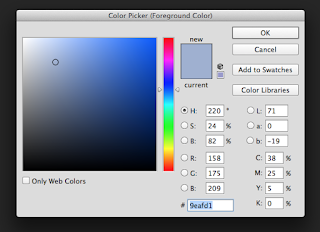
colour picker (allows you to choose your colour)
colour picker (allows you to view the library of colours


select a book 


you can use the pin strips to find the actual colour number. you know that this colour on the screen is what will be printed out.

the colour pixel will be reproduced? with cmyk any colour with in photoshop with be reproduced in cmyk. a mixture of cmyk colour ink.

using spot channel in photoshop

1 channels pallet

2 menu on the channel pallet.

3 new spot channel-choose a colour that your spot colours are going to represent.


4 after choosing the colour rename the title of the colour and add spot. adding spot is a good practice for understanding also if you just call the colour by its name photoshop may get confused with its own colour  then press okay.


* black areas on your page indicates were ink will be printed on your page and white ares will be were there is no ink printed


*when you paint on the page when you paint over the black, the black doesn't be affected because its used with in a transparent feature.


double click on the image in the cannel pallet you get the opion to edit the colour of your channel
usfull for experimenting with different colours


colour select will allow you to prevue the colour range or channel


 turn up the fuzziness and press okay.

create a new spot colour.


choose your ink and retaitle it and press okay 
turn of the cmyk channel to identify your channel it makes it easier to see.

create new spot ink channel-select colour-go to select- colour range select a colour and lower the fuzziness do this on the selected colours that you think you ail be using through print screen. 

for example below i created 3 new channels for each colour i will use in print screen 1.black. 2. light 3. orange. me and sam can now select each colour separately. easier to view each screen.


when saving make sure the spot colour box is ticked


through the image into illustrator. new page and upload the image on to the page using place in the file settings .

then go to windows and select separation preview


when printing your image make sure the template look like this EASY NOTE TAKING


knocking out or over printing.

example


the solidity opion is the percent of the transparency of the colour
this will change the value and the cloud with in half toning


you can change the stacking order of your layers that will effect witch inks are on the top. witch ever is the top layer is the ink that is printed first,


example of moving the layers and moving what ink is printed first. OVER PRINTING

knocking out would be the opposite of over printing. the ink are locked out of each other everything is printed onto white cartridge. 

* cmd and 0 brings the screen back to normal from zoomed in or zoomed out…cheers sam BLOG SHOUT OUT 

Monday, 19 October 2015

After effect workshop


adobe after effect introduction 


how to use after effect for granddads who can't use computers

1. finder - applications- adobe cc- aftereffect

2. unstick welcome starter box. never shows up again.

what and how Panels work.

highlighted panels are the active panels

-project panel.

list of the things and assets you will use to create your animation.

-time line panel.

the time line is decided into 2 parts.left side (like photoshop layers) right side is the time ruler this is were you range the assets ( were you decide whats going to happen and when)

-composition panel

were you see the results what you have created

3. click pages to highlight - composition - new composition - presets - pal widescreen square pixel - pixel aspect ratio - square pixels - frame rate - 175:96 (1.82)

4.change time duration to the leghnth of your short film will be. 

5. change background colour 


in after effect when things are highlighted in blue you can change them. click and change manually or over mouse over the highlighted area and click and drag.


to change any of the settings during go to the composition settings

creating layers.

highlight the time line panel so its highlighted blue - layers - new - solid - adjust size - ok


time line panel, the red bar represents the solid we've just created.

editing the solids time span, move mouse over to the edge of the red bar and click and drag to adjust the length of the solid.

you can move the solid by clicking the centre of the red solid in the centre and drag it to were you want it to appears on your time line.


adding another layer as explained before.


if you need to make another copy of a layer you can go to edit copy and duplicate the layer/solid


how to play back your composition. to the right is a preview panel works just like a dvd player :\


the play button will play your composition slower than the actual speed. to play back in real time use the ram preview bottom on the end of the play back list on the play back panel. the one highlighted in black on the image below. so using the ram prevue gives you a accrete play back.


if the video is too complex it might not play it back for you. change the resolution of display in composition window whilst working. you can change it the resolution to half so its only every other pixel that is shown, the image will be less quality but this allows after effect to be able to play back your complex composition. a temporary change on your play back it ail not effect the final result of your short film.

deleting solids. click and highlight the layer and press delete

layer properties.

accessing the layer properties in the time line panel to the right.

by the side of the layer you will see a triangle click the triangle and  it will drop text. double press transform and the properties of the layer will drop down. here you can edit the information at your own will. remember text that is highlighted blue indicates that you can edit them. e.g.. rotate, scale position and so on.


how to animate in key frames. 

key change a significant change with in the composition

move the blue arrow on the time line panel were you want the animation to start 


line the time line panel into the layer properties click the stop watch. by doing this it has fixed the poison of the layer there, move the time ruler along to were you want the animation to stop. click the blue diamond to lock the animation. drag your solid to were you want the position to end. like below 


move the time ruler with in the centre of the animation time line. drag the line on your solid to a position you want it and the animation will move along the track you've edited. 


when ever you make a new point with in the time line of the animation make sure you press the diamond and make it blue to lock the animation in. the left side of the image below. also the arrows by side of them let you toggle from lock positions through out your animation.


exporting

got to the composition- add or render queue. this will create another tab to the left hand side of the timeline panel. render setting - best settings - time span to drop menu - export choose press ok. then on the left hand side again click lossless - press format options - click animation menu and press H264


again at the left hand side of the time line press the output as seen below 


and then press save.