Sunday, 30 November 2014

Illustrating the newsagents- screen printing

As this is my first time screen printing I wanted to document the steps so I could refure to it later.


• clean down station. Take one side of the paper over holes 


• ready the sheet to be put in the vacuum and the image to be burn onto the screen 

 
• paint out any unwanted marks 


• bolt to frame 


• WHAT BE THIS DARK MAGIC!!!!
I pulsing get my head around how the image was been created on to the paper

At this point I saw screen printing a very long and useless process, I saw the image printed out and it made me think we have just done all that and we ended up with what we had at the beginning. 
We could do this using different coloured pens. 


• after we did both colours through the screens it was time to fold them, hot dog books seemed simple how ever remembering how to fold them so the pages was in the right order was a difficult task and had to get help. I will devolve more hotdog books to get better at this. 


• final product. Very effective way to produce a book. I will make more of these in the future but maybe digital and not screen print as I feel we ended up going a long way round to finily have somthing we already started with. 

Illustrating the Newsagents

Beggining our group task we spoke how we would go about starting this project. We decided the best idea would be to visit newsagents and find somthing that inspired us. At the first few visits we learned that we we intimidating the shop assistance staff and we was getting nowhere  So we took one of the mini tasks and maid it out main aim of the day, to ask the the shop assistance if there has been any funny,strange or bizarre things happen, and how they felt about the other larger shops in the area. The answers motivated us so much we decided to push this forward and to make out hotdog book based on these events. 

• sketch book work
• observational drawing 

•fruit stall

• man shelf stacking

• fridge 

• scared shop assistant 

•out sides aladins shop and a strange woodenly thing with beads on the end for£2

After the creepy observational drawing
We began to ask the question..,

• a man half naked once ran in and stole some milk

 He never said whitch part was half naked but my humour imagined it his bottom half 

• a man once died there in the door step boom just died 

Drawing of a dead man been asked by the grim reaper if he has finished with his trolly so he can use to for his dead body


• this was a conver station we had with one of the shop owners, he built this story up with an exciting ending but ended with a terrible silence!

After our day of research we had a body of work to progress with as a group we spoke about who wanted to do what I was happy to illustrate any of the story's. The group decided that I would be best at drawing the depressed shop owner who had work for 15 years at the same shop. How ever I wasn't there when the group was talking to him so from there comments I started to make thumb nails of the scene how I imagined it in my head.

• these are the thumb nails 


• using expression to tell that the man is depressed I wanted to test how it would look and if it would tell the same story by using suggestion. 

Here are three of the thumb nails I pushed forward 


• personally I prefer the last image. Not because it's grim but because it takes the story of the depressed man and exaggerates it! I also like how the back ground is silhouette and the foreground is detailed. Also there's no evidance of the man hanging it just suggests that! I'm probably more taken to this one because I caught the expression with suggestion.

• the group thought it was too close to the bone and that they felt I should work on the first image.

•Iv never used screen printing before as a method so I have no ideas what makes a good one. I'm a bit lost as how what works well drawing wise so I'm keeping it simple 

•here are some of my colour test for the final print.


• the image ready for light boxing onto the paper that is going to be transformed into screen printing. 


Cowboys and Indians-texture


For the past few weeks on this project I felt I couldn't really connect to the project and this was effecting the results of my work. They was half heartedly done no workmanship with in it. I felt that I had run dry of studying Cowboys, but after researching a little more and finding somthing that inspires me I felt I could push on and give a little more than I have been.


• I drew a cowboy from mind and added cuttings of shape to the leather parts of his out for but only to the parts I wanted shadow I think it has work really well on the hat but not as much on the coat, if I had done smaller cuttings and expressed the creases on his coat then I feel it would have been a stronger image   

• I added black pastel for a textured back ground, I think it's a really good medium to use to capture technique.


• after realising how nice of texture pastel  is I pushed it forward. I fell in love with the oil colours smudging and battling with each other on the page. I wanted to express this and the texture that it was developing and to show it at its best I did it with out strong line work and without identification of any of the characters features. 


   • a bit of an easy one here but I'm happy with the results on this one. Not for texture but for the perspective of the image. I used white card paper and blue roll. I cut out line and shadow out of the card so the textured paper would be the voice of the image.

 
• back to ink, I think ink splashes bring great tones and texture values to images. If you can look past it as a splash and as a image you can really see weathered and old skin 


• using 2b pencil and using a pressured and tough technique to build up the lead on the cartigue so it would smudge. I then stool it in my bag rapped in silk to see what texture it would develope. The result I got was impressive I feel it defiantly gives a texture. A fog smokey feel, old sepia, and slight moment is caught in this method. Love it

Sunday, 16 November 2014

End of module self evaluation


Play play play evaluation

Play play play Evaluation 

With in the project Iv made a body of thumb nails and roughs a lot more than my other projects. I was back and forth from ideas experimenting what would work and that what wouldn't. This really helped me progress through out the project and get to a happy final project. Although I have produced work I am pleased with.I feel I should have taken more time and more work on in my sketch book on lay out and finding what techniques work well against each other! Experimenting with that as well as making lots of thumb nails and roughs would really have worked in my favour. Looking at the final three you can see that there is so much going on, with the ape one it's difficult to grasp the the depth and prospective I feel there is too much going on in the middle. Too much line work and methods created a busy tone! 
On this project I feel that past briefs has had a influence in it, I went back to old sketch books refreshing things that I learnt on before and looked at line work and shape work from the cowboy projects. 

For future reference I will take more time in my sketch book on roughs on lay out and line making comparing styles agains each other and identifying what works against each other. Taking note from the class feed back If I ever need to use txt in my images I shall study typography 

Saturday, 15 November 2014

Play play play-feed back

• class critiquingo 


•some of the comments
-super busy! Handwriting in type and Image disnt go with the style! 
-looks a little messy 
-sharper type on font 
-txt could be more clear
-focus more on type graphs 
-txt in the images could have been thought about more
- lose the handwriting kid! 

• positive feed back 
-love the line work 
-work well as a set
-so detailed and accurate love the monotone work
- tone king
-could proper imagine opening a comic to see this in a book! 
-the king 


• The feed back I got was mainly aimed at the txt I had used, I tried to go for a comic book stlye don't and did it my self, I should have printed it off the computer to make it work. I was told to experiment with colour, yes I should but I wanted these to be black and white to work as a set, I felt using colour would brake them up, I wanted it to almost look like they had been taken from the same environment and using colour would disturb that and make them look like they had been taken from different parts of the world.

Play play play


• my final three piece I felt they responded to the brief well. It took some working out and a lot of sketch book work to get here. There is still room for improvement for sure such as lay out and experimenting with texture and tone. The images are slightly too busy to how I like them but I thought I would experiment with this since my work is usuly not as busy and find out what others thought from the group crits for future use.


• I really enjoyed this project it was easy to challange my self and it was a flexible brief that gave me the opportunity to work with something I find interesting and able to push a new Midea forward again.  

• the third image isn't as strong as the others, I don't work with land scapes and this shows that! It was meant to be a jungle top but I lost that with trying to express it too mush with the castes shadow from the Lightning. 


Cowboys and Indians-shapes

• using shapes to create Cowboys.
I enjoyed the process and the challange but I was never happy with any of my results. I understand my work and my limits and I could visualise what the realists would be, I knew they wouldn't be greate! I think this has a massive impact on my work this time, and it stopped me having a connection with it.


• after seeing the poor quality of work I was producing I felt I needed to consentrate and make a couple of images that was more like a final piece to try and get me into it and motivated.


• I was happier of the results of the last two because they seem more crafted and more time was put into them how ever when I look at them I just see messy cuttings and collages, perpetuation is wrong and I can definitely see a lack of motivation in them. For the next project on Cowboys I'm going to research movies based on Cowboys and work from reference that I fall in love with to get that inspiration and motivation to create good work 


Wednesday, 12 November 2014

Play play play


• this is has far I'm going with the Thor piece, I'm happy with it but feel it won't work as a set! As a set I feel it will come away from the task and just be a marvel based theme, I was thinking how to keep it as a set, I was going to use a  Asgard theme for the txt image (like below)
It was here when I thought this willing work! 

So I decided to go back to my sketch book and brain storm to find a set that would work well to the brief 

• these are the brain storms I came up with 

• the salmon for water current!


• to keep them as a set I would base the theme on nature! Electrical current in the jungle. I'm planning on keeping the tale.

• Trying to keep it as set and trying to find a jungle theme for the image with txt. 

I did some research so I could find away to make the word current fit in with a jungle image, I was planning on putting the txt "currently in the jungle"
But after research I found a news artical that is current today. The news artical is that the apes are morning for the 6month old chip has died at a local zoo! 
You can't get more current than that!


Tuesday, 11 November 2014

Play play play


• more sketch book work. 
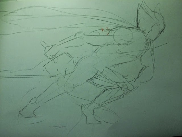
Playing with electrical current, Following some peer feedback, I decided to use the idea of Thor and his hammer because of the electrical current he uses when he uses his hammer and the fact that my work is mostly inspiered by comics and films 

•here I played with lay out and tried to find a good way to make the electrical current the main feature of the image and not let the main character be the main attraction 


•A more detailed rough on A3 to test if my sketch book ideas could work. 


• I felt that the second detailed rough could work because the movement in the picture would take away the focus on the character and if I left negative space on the left I could realy play around with the electricity. 

•this is a w.i.p of the Thor image.

Acrylic, ink wash, water coloured pencils, sharpies. On A3