Monday, 1 May 2017

Leeds Haunted - Kirksall Abbey


Kirkstall abbey 


The Documentation of the site will be spot illustration of the location with one or two illustrations that describe the stories and situations. The page will be filled with comments and statements from my research of the Hauntings of the abbey. 

After gathering information and statements of the location I took a visit and took some photos for reference. When I visit locations for research and reference the photos I take are never just for the sake of it. Each photo I take is a potential shot for a panel in a comic or of a stand-alone illustration.

Here are some of the better photos I collected from my visit to help me produce the publication. 


Going for the comic feel for sure on this one. doing what I love the most and exaggerating the shadows to capture depth and atmosphere. 

Below are colour tests. test to see which of the two look most like the night scene.
I think both look like they are at night but the one on the left has more of a creepy feel which is what my publication is about. Note to self, that the one on the right is perfect colours for a moonlit night scene. 


After choosing the right colours for the dark I cleaned it up added grass and additional low tone shadows, stars and clouds.


Making the spot illustrations friendly for text. I made the image work into darkens as I plan to use the solid black space as a platform for the stories and statments.


I used the same proses as i did on the first abbey illustration to make 2 more illustrations for the publication. again the darkness to the left and right of the following images are to be covered in text.

The Hall ( window shot )


The hall ( gate shot )


So the illustrations for the pages are finished. The next and final step for these is applying the text of the stories from my research. 

Tuesday, 18 April 2017

FMP. Leeds Haunted - The Middleton railway tracks ghost


Kicking this project of with some history research of the Middleton Railway.

The Middleton Railway in Leeds is the world’s oldest continuously operating railway, having been established as early as 1758. Today it is operated by a trust, ensuring that the pioneering history of this engineering feat is preserved for future generations. The railway also holds another, less salubrious world’s first, in so far as the site is thought to be the location of the first ever human death caused by being struck-down by a locomotive. In 1821, a young man by the name of David Brook was walking home from work along the track of the Middleton Railway. It was the start of December, so night had fallen early and the area was experiencing thick, heavy sleet, obscuring vision and blocking out the moonlight. The wind was up, whistling past David’s ears with a high pitched screech. As the young carpenter continued to plod along the tracks he was totally unaware of an approaching locomotive. Likewise, the train’s driver was unable to see more than a few meters in front of the train as it trundled through the night.
When David became aware of the approaching steam engine it was already too late. The train struck him down, pushing him onto the tracks and dragging him under the moving carriages. When David’s body was discovered it was mangled and broken. Reports stated that one of his arms was cleanly torn from the shoulder and that the victim’s stomach had burst open, exposing his guts and organs. The corpse was a bloody, pulped mess, having been rolled along the track under the train for as much as 100 meters. The young man left behind a wife and two daughters. According to the local legend, David’s wife and children were unable to support themselves following his death and were evicted from their home. They ended up in a near-by Poor House, where they became the de facto slaves of a factory owner. Sadly, the poor house was where the two daughters ended their lives, both succumbing to an outbreak of TB in 1823.
Since the accident all those years ago, reports have been made of a ghostly figure wandering along the stretch of track where the accident took place. Witnesses have described seeing a man, dressed in a thick coat, stumbling along the railway line, often with one hand over the top of his face, as though he was sheltering his eyes from the elements. The ghost has been observed for as much as a minute at a time, before suddenly disappearing in a flash of light. Interestingly, the figure appears to be fading with time. Early sightings described a totally life-like apparition, whose appearance was indistinguishable from a living human being. More recent sightings, dating from the 1980s and 1990s describe a transparent figure. Although the details remain clear, the ghost has become see-through.

From research and reports its said that the ghost is seen walking the strips of tracks to and from the station. I did have in mind of drawing someone at the station waiting a train then seeing this manifest before them...but that isn't true to the story and looking at the location of the tracks there isn't any places that would suit the story...the tracks are mainly destroyed and some pulled up but the ones that are there are at the pavements out side industrial estates and what not so they are not as good as a location for a comic strip...remember this has to be believable.

following the tracks on google earth i found the tracks around 200 yard away from the site that this tragic accident happened that is more suitable...still a long shot but we will see how it terns out for the location of my story. The location I found runs along side of a set of 5 aside courts. with a path that runs along side the old tracks and that leads to and from a sport academy in south leeds. so it wouldn't be uncommon to see some one walking home from college or work on this path or walking their dog. (south Leeds stadium)
below - from the Leeds Academy to that estate is where my story will be told, the white path from the college you see is where my character will be walking through to get to the estate.


Here is where the apparition will take place.


This story holds 2 characters, a girl in her late teens early 20's and the ghost. 

the girl concept - 

I want the characters to my comic to be as realistic as possible, I read that some comic artists who create their own comics use models as reference (when they are not working to a deadline ad have time) they have a model or actor come and take shots of different expression and different poses to help create their comic. so I felt doing this would help me get that realistic characters by having a body of reference to work from.  I got Georgie to be my model for this one as a test to see the difference from working from reference and actual people as my characters than making characters up through a concept. I drew the photos into my sketch book then scanned the into digitally ink them to give it that crisp and professional look. I'm certainly happy with how they came out, using a life reference has changed my game completely I feel with the level that they came out it will lead to a stronger looking comic book.


the ghost concept.

I was going to try a sayonce to contact a ghost and ask if it would be my model for the comic but I realised that might take some time and that's not what I have right now. so I used myself as a prop for this guy and used my imagination to make it look more ghostly, I did try to make this character look less like me by changing my bent nose and the facial hair. I think it's important to keep the ghosts human-like as research states that it's always humans seen, none of my research says that they had seen a creature that looks something like ghost busters. BUT I do need it to be creepy...so I gave them a no eyes look and this guy got a tormented look on his face as his fighting through the blizzard.

whilst drawing this piece I started to question how to represent my ghosts in my comic, should the viewer be able to see them all the time as they following characters? of should they only appear when the characters see them? on films, its creepy seeing the ghosts behind the door even thought the star can't see them but it's also creepy not seeing what's making things go bump in the night.


Whilst creating the layout and rough compositions of the panels I decided to create the story at night. I found this a challenge and didn't want to do it due to not doing a night scene before...I know I could have done it by lots of positive black space and hues of blue but that's not how its done in the high standard comic books you see today. so I decided to learn this skill now whilst I create this comic. I didn't want a tutorial on this because I fell that when you watch them you pick up the habits and the style of the artists making the tutorial. and I'm happy where y style is at the moment it seems natural and doesn't feel forced in any way and it taken me a good few years to get to this point ( yes I am influenced by other artists and other styles but I don't want there to be significant changes to each panel e.g my style character with a different style background) it would through it off. so the best thing I should do is read and look at how comic artists have done this and then put the comic book away and translate that into my comic in my own way.

The comic book that I started to read was called OUTCAST its a creepy comic all about demonic possession a lot of the comic is based in the night so I got a lot from this comic. not only that but as the issues go on the artists change so I get to see how other artists approach a night theme with the same story.


Below - an issue file that shows my step by step of how im creating the pages for the comic.


page 1


I was happy with the colour choices I made to represent that night scene. I feel that there's no question whether this scene is night or not. keeping the background minimal detail helps the focus on the story of the characters but there's enough information there to set the scene.

Page 2


Out of the 4 pages, I think this is my favourite page, the backdrop panel works well, I think it helps show what's happening, is happening in the space of a few seconds. the body languid captured in the character that's stood on the banking is my fav part of this page, there is very little detail in this its solid blacks and colour and its the part I'm most proud of...surpisingly becausee I usually love the more detailed things.

Page 3


throughout creating this 4-page comic, I tried to think of it as a movie, using different camera angles to help the story be more interesting and scarier.  I struggled with the colours of the ghost, I tried glows and greens and it never looked right the colours you see now are what I feel make this more convincing and more creepy.

Page 4


Overall I'm happy with the results. I think it's a strong short comic, yes there's parts that I know I will revisit to touch up and spend more time on, such things as the trees in page one and the character in panel 5 of the overhead view. but putting that aside I'm really happy with the night scene, as I stated before,  have never drawn a comic set in the evenings using the ways that other comic artists do.  The panels flow and are interesting...each page speeds up and slows down for the full effect of the story. All these I will take with me and use throughout this publication.

Monday, 3 April 2017

FMP. Leeds Hsunted

I enjoyed COP that much that I want to recreate the project again :)...Joke! i did enjoy the practical very much. i feel that the research and the response to that is what made my project enjoyable and successful. illustrating war stories into a comic book format was great i feel it showed me my strengths of story telling....even though i got a great grade and a great feed back from my advisor i felt the pages that was created was really week, the images wasn't strong, wasn't strong as i know I can create. The reason was that i was so hung up on the research and the style that i had left my self no time to make the final pages great. Taking all that in to consideration and realising that working from primary research, first hand experience Is what i do best and the feed back from my tutor backs that up. it says that I should conceder this for future projects.

This time around will be the same research tactics...interviews, on site research nut what i will do differently is manage my time so that i can actually create full pages with nice quality work.

So i know what i wanted to, I wanted to work with my strengths and create a publication from research but I was at a loss of what to research.there was no visual evidence of my planning, it all happened in my head so theres no documentation of mind maps and what have you...sorry.

Like most my projects i mention i'm a huge movie fan, thats where i want one side of my profession to exists (concept artist in tv and film...the other side is to publish my own comics and to be a successful comic artist) So when watching some scary film I was entertained and questioned how people say they have seen shit like this (ghosts and demons) even though I am skeptic to the after life and the paranormal, listening to the stories that people say about the hauntings they have experienced still entertains me in the same way a film does, it gets my creative mind going. I never say I  dont believe the stories because i think thats just rude, and who am i to say that they are lying because i dont know that!...it entertained me and creeped me out and thats good entertainment and thats good enough for me. so this lead me to an idea of visually documenting peoples hauntings and experiences. but because thats a pretty wide range I decided to keep the research local and ask people in the Leeds area. so like i always do i jumped the gun and started playing around wit a title and it lead me to 'Leeds haunted' I then wanted to make a publication not only of peoples stories in there homes or what have you but of actual locations in Leeds such as scary old pubs or the abbey even. a combination of famous locations and the publics encounters made for a good book. but i dont want it just to be all pictures... My plan is to create a publication that looks at locations of Leeds. with each location there will be illustrations of that along with text, statements of peoples paranormal experiences at this location. in the publication will also be stories told in the comic format to better tell the stories. This publication will be for entertainment it wont be a statement that says YES Leeds is haunted but just some entertaining stories for fans of comics and creepy tails.

I started this project by looking at horror comics and illustrators to be inspired and influenced and just to get a idea to see if this can actually be done comic wise...if the pros dont execute a creepy story through image then i wont be able to.

Researching Leeds and its most haunted places. To my surprise the Leeds Beckit university has the most encounters and stories that I found. To look at this issue file you would think that this research took my the best of 3 days. hours of reading, and filtering the dud stories from the good ones, watching hours of video documenters about Leeds history and haunting.
The research was so inspiring i felt that with the information and the contacts i gained through my research allowed me to create a stunning entertaining publication.


I created this poster to invite people to share their stories with me. I tried to express that feeling of someone is in your room and that creepy sensation of not wanting to turn around. This must have happened to everyone in their life at some point so everyone can relate. Having some connection might trigger stories of pursued the viewer to share their stories.


(LEFT social media RIGHT poster)


I put the poster on social media accounts, Facebook and Instagram with a message asking for stories.


From my research i gathered i found the most haunted locations of Leeds:
The Abbey, Thackray medical museum, Temple Newsom,  Armly prison, Town hall, Music house theatre, the becket university and  other streets and parks. I sent out emails to all these locations explaining what i am planing to create and asking for any statements from staff or any other connections to the location. Just awaiting a respons...i will document the response through the development of this project. because i have taken on a rather big task i have decided to create as i research...meaning i research one location and create one location at a time so that i'm not waiting for all the replies.

I have had some feed back from the posters ad from the word of mouth. I have 2 stories from students from leeds college of art, and through word of mouth I have planned a visit to a pub that my peer works at and she has told me there is a chance she can get me access to the haunted going ons above in the run down hotel. she tells me that other staff have stories and locals share stories of encounters in the local pub. she may also get me a contact of someone who works in the town hall that is on my list of most haunted Leeds list. 

Tuesday, 14 March 2017

Roald Dahl. concept - key art - editorial


Roald Dahl Literary Estate

To illustrate iconic characters and scenes from your favourite Roald Dahl stories
Brief 
To illustrate iconic characters and scenes from your favourite Roald Dahl children’s stories. The illustrations should appear as if they are part of a published series. 
Background 
Roald Dahl was a spy, ace fighter-pilot, chocolate historian and medical inventor. He was also the author of Charlie and the Chocolate Factory, Matilda, The BFG and many more brilliant stories. He remains the World’s No.1 storyteller. 
The Roald Dahl Literary Estate manages the Roald Dahl brand. Recently, we developed a new brand identity to provide a common bond between the many books, films, musicals, and even digital apps based on Roald Dahl’s stories and characters. If you had to sum us up, we are… 

– MASTERS of invention! 
– MAKERS of mischief! 
– CHAMPIONS of good! 

We believe that every child in the world should enjoy Roald Dahl’s stories just as much as we do. If you agree, then we would love to work with you. 
Objective 
This year marks 100 hundred years since Roald Dahl was born. Yet Roald Dahl’s stories are more popular than ever. We want him to stay that way. 
The Creative Challenge 
We invite you to illustrate a series of iconic scenes, featuring at least three iconic characters from Roald Dahl’s inventive, revolting, wicked, or friendly stories in a style of your choosing. None of your illustrations should be boring, safe, or predictable. All styles welcome.
The scenes can be from any of Roald Dahl’s stories for children. You’ll find a list within the project pack as well as a selection of extracts for your inspiration, but you don’t have to stick to these. 
Target Audience 
Our core audience for Roald Dahl’s stories are boys and girls of the future, aged between 5 and 11. They don’t necessarily identify themselves as fans of Roald Dahl – yet! They may prefer YouTube, their games consoles, or messaging their friends on SnapChat. You should aim to make them love Roald Dahl’s stories just as much as you did once upon a time. 
Mandatories 
You can choose to illustrate between one and three scenes. Within this series, you should illustrate at least one child character, one villain character and one fantastical creature — whether this be a witch, a giant, an insect or an oompa-loompa!
You can select scenes from a mixture of novels, although the illustrations should appear as if part of a coherent series. 
The illustrations should also compliment our logo - you’ll find some copies of this in the project pack.
Deliverables & Additional Information 
For guidance on how to submit your work, please adhere to the main Deliverables information which can be found at the YCN website. 

below -  A list of books that the project pack provided. I gave each book a quick study looking for a spark of inspiration. Like a Cle shay the only famous, most known take my fancy, only the famous ones take me back to my childhood...Charley and the chocolate factory, James and the giant peach, the witches and fantastic Mr fox. 
The project pack has a file with full of parts from some of the novels from Roald Dahl. Again the parts that are from the famous, the ones that took me back to my childhood are the ones that started to come to life in my head. I started to create illustrations and test composition in my mind whilst reading them...so I don't think this project will be one that I test myself and push my practice out of its comfort zone. I think it will be one that I let my creativeness guide me through. judgement and dissections will be made by fun and love for the project Not to challenge or test myself to better the grade of the project...just good old enjoyment loving what I'm doing.

James and the Giant Peach
Charlie and the Chocolate Factory The Magic Finger
Fantastic Mr Fox
Charlie and the Great Glass Elevator Danny the Champion of the World The Enormous Crocodile
The Twits
George’s Marvellous Medicine Revolting Rhymes
The BFG
Dirty Beasts
The Witches
Boy
The Gira e and the Pelly and Me Going Solo
Matilda
Rhyme Stew
Esio Trot
The Vicar of Nibbleswicke
The Minpins 

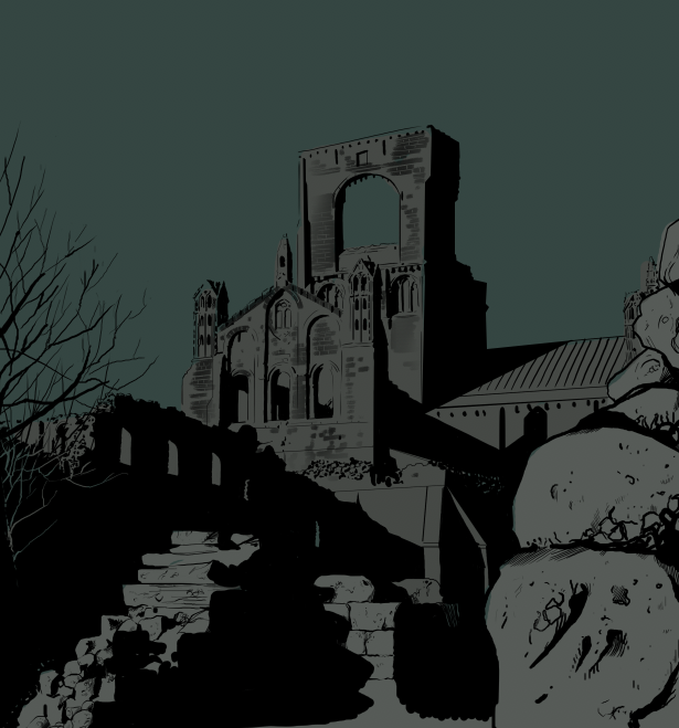
I decided to start this project with James and the giant peach novel. I was more inspired by the description that was given in the project pack. like I state before it whilst reading it, my creativeness was more active with this one than the others. I was playing the scene in my head and imagine the insects surrounding James as he meets them for the first time, I started drawing the characters and the scene in my head right away as I read this...the characters a little darker, James a little more characterised than my normal style. I was excited...so best that I started with this. 


I don't want to be a million miles away from the original art of the books created by Quentin blake, as they are part of the Roald Dahl franchise and are just as rememberable as the storeys them selfs. I want to take those characters but give them a more modern twist, and translate that through my style.


To do list -
James
grasshopper
spider
lady bird
centipede
earthworm
silkworm
scene/location

Action plan.


To creating a body of work that shows development of character and location Final outcome to have presentation boards that show process and developments of the project and a hard copy of the final rendered piece of the image.

CHARACTER CONCEPT


Below - Issue file of the concept development of the characters 


I made some quick thumbnails for the final image. I knew what I wanted to draw but I was questioning the scale, and composition of characters. 

A quick black and white thumbnail to work out lighting and concepts. the characters in the four ground will be out of focus as if the view is behind the characters in the foreground.


working on the concept of inside the peach. going for warm colours and a dingy setting but needs to appear that the surroundings are thick to represent giant peach.


process developments-
now im happy with the concept of the peach i used that as my background and sticking the the rules of drawing (working center out)  I started to draw the chacarters that are in the midground.


then foreground


 I was aiming for an illustration or a kind of key art piece but during drawing this I felt that I wanted to draw something that could exists in the books (an interior piece)  So I decided to keep some thins a little quirky. the hands the overlays and some features of the face left less detailed as they was in the concepts stages.

below - For some reason I prefer this as a submission for this brief...its more striking and looks part of the franchise. maybe because it looks more like the illustrations for the novel the artists uses a white negative space so the resemblance is what is making me like this more.


Final image.


I enjoyed creating this because it was a different style to how I would work. I do feel the concept process was the stronger part of the projIct. I feel I had more fun with that becuase it was creating the characters and more decisions had to be me it allowed my imagination to go wild as for the final image I was held back because I was having to stick with the concept of the scene. obviously I feel that there is so much more I could do with this but the dead line was getting closer and closer to each time I decided to rework part of the image. I feel it works well as an editorial piece and as a key art for a concept project. 

Han solo digital sketch


I decided to take some time and test my digital skills. when I started my illustration degree my practice was all realistic paintings and pencil images. through my degree that was lost I came more focused on comic book style. but with previous contract work it made me realise that I still need those realistic skill in my portfolio but after learning that the industry is heavily digital I had to test if I could digitally paint an image and still get the same results as I would with my analogue illustrations. 
I wasn't feeling too confident as I have never done a realistic portrait digitally and I've not touched realistic illustration for at least 3 years as my practice has been almost 100% comic style. 

So knowing that this was something that I had to do ad practice on, I needed to find an image that inspired me and gave me the drive to make a good drawing. Even though I'm trying my hardest to come away from the hole fan art I felt that for practice I need to work on something that I enjoy I don't want the practice stages to be a chore I need and image I can recognise. I had thought abut doing digital paintings of Georgie, mates tutors but that didn't actually appeal to me as much as drawing a something from my childhood...ya guessed it! STAR WARS. Han solo was my childhood hero but I didn't want to draw the younger Harrison ford but the older one. choosing the older one would be more challenging. the creases the age, the character all would be a good test. also ford has a deep eye set and a wonky nose and a killer grin...if not drawn well this would just turn out a bad representation. again this would be a good test. my attitude to this test is ' if your going to do something, go all out and do it well. I looked for what I thought would be the hardest drawing. high level of lights and shadows, fabrics, double light sourses. 


I chose this one in the end because it ticked all the boxes I was looking for in a challenge. the heavy light source from the left nad side the second light source hitting his right cheek bone the heavy shadows around the eyes and nose. the only downside was that I couldn't find a bigger image of this so I couldn't blow it up to get the detail.  

I knew that the project would take me days but due to work commitments and other projects I didn't want to spend more that 3 days on this painting. and were I am up to on day 3 is where ill post it and work on the painting if it's not finished I'll spend an hour when and where i can to finish the painting.


the painting took me 18 hours over the space of 3 days to get to this level. I'm happy with the results so far. for me the face is looking realistic and the clothes the most time-consuming factor of this project was the hair the hair is about 10% complete but when finished I think it will finish the image and make it look more realistic. through out this project I learnt more about digital painting and how to translate an analogue technique into a digital one. 

below is a link to my development of the painting. a video of screen shots taken at key moments of the developmets  

I got to spend a little time on the hair and back ground.


Friday, 3 March 2017


So I've been thinking about this practice development project iv got going on a lot over Christmas. I have decided that I'm going combine the figure drawing project with this one. both are practice development but one focuses on bettering my knowledge on the the figure drawing, anatomy, portraits, 360 heads shot, etc. the other will be bettering my knowledge and practice with my digital work hoping to get my digital skills to a higher standards.  so in a nut shell there will be two projects running by side each other, both will be bettering my practice to become a concept artists and illustrator. 

as one side of this projects focuses on anatomy and figure drawing, the other will be more free and fun. just me studying/ researching digital painting. spending the evenings having fun painting. 

below are some qucik digital pieces I created during the christmas break ( had to be qucik due to cop)  
below expermenting with depth but trying to use a light sorce to execute it. 


again creating depth using ' into the blue technique' i learnt this effect when I was about 9...good old bob ross but i wasnt that good at doing this effect with paints but with digital it comes pretty easy. not the best but its far better than i used to do. 

below - i learnt this pastle effect that really works well to express little lighting...too big and it goes to mud but if its little it looks pretty neet. I decided to draw a grinch for the excuse to draw fairy light but i didnt want to draw anything cutsy, that stuff just boars. 


During this project Personal project I gained a freelance project working in the concept industry.
there I learnt that i need to develop on more techniques to better my career. I need to work on matte painting and photo bashing. both skills that I'm not as strong as my painting abilities. I will be developing these methods and demonstrating and documenting my progress on this blog post.

This project may seem a little everywhere (as it does to me) but the aim of this project is to develop all aspects of my practice, to document my experiments and developments of my practice. So what ever is uploaded to this project are images that i have created to better my practice it will involve lost of fun and experimental images. digital paintings, mette paintings, photo bashing, anatomy, still life all that will better my practice.


Colours may vary - out of order exhibition

The idea of creative something out of order was a tricky one, i knew that others would create something generic. things such as, a series of characters in a row and having an odd one with in it that makes it out of order, good but predictable and none challenging. My original idea was to create the space odyssey scene with the monkey smashing the bones but changing the monkey for a space man…not very out f order if I’m honest I i was trying to find an image that i could create a nice looking piece something that allowed me to draw to be able to create something with technical line work and depth. i saw this as a cop out. 

i have a strong interest in things dark and gritty as we all know and this is something that i know i can comfortably create with ease and still come out with good results. due to work commitments the best thing for me now is to stick to my strengths and use that for quality and speeds. 

again due to work commitments this wasn’t a project that i could spend time on thumb nailing and making tones of references…any at all for that matter. i have been working out in my head of ideas that would work. hospital doors boarded up with wood with zombie hands coming out with a sign saying out of order…most ideas was that things being out of order with zombies in them. I tend to run off in my imagination pretending I’m in the situation or location of my piece…i imagined being in a zombie apocalypse and the story in my head lead me to a car surrounded by zombies impossible to get to..the car would be out of order! i wanted to go more playful with composition so i didn’t want to do a scene but wanted to make a centre piece that wasn’t grounded by location. so stepping away from a vesta and more of an illustration for a change. i decided to make the zombies in the car trying to claw there way out again car out of order. for some reseason the car was always a mini in my head, i tried to imagine the car as a van, a bus, a police car and all just wasn’t right…the mini was slick playful and some what entertaining.

I created this piece in my own time, i started it on my dinner brake at work and it was here that one of my friends there suggested that it would be rather fitting that the zombies should be clown zombies…like the act ‘how many clowns can fit in a mini’ i thought it was perfect! it fits that bill, clown car out of order…imagine your a punter going to go to the show and it says sorry clown car out of order…it works again its playful and interesting and still tells a story. 


I was going to paint blood on the car…hand prints, maybe some guts. I asked Georgie her thoughts on this and she asked “well have the zombies been trap in there or have they turned into zombies inside?..if they have then there won’t be blood on the out side” GOLDEN this illustration now has a story…Georgie looked at the illustration and found a story to it thats what I try to achieve with all my work. leave people questioning what has happened. i felt t would be more of a brain teaser and a conversation starter if there was no blood on the car ‘why?’ maybe they locked them selfs in and eventual died and came back, maybe they was preforming there act and one was infected and once the doors was locked the infected one attacked the others and left them all like that. who knows its up to the viewer to decide what has happened to the clowns but all thats important is that car is now out of order. 


my favourite part about creating this was working with the same weight of line there was something satisfying about working with it, there was no room for error, if you miss place the line it shows it doesn’t run trough with the other lines. everything has to run smooth…i didn’t run smooth through it all at all! but trying to was great fun. colouring the mini was great also was the perfect opportunity to practice that  shine technique by only using colours. regarding the zombies - it was tricky making them look like they belonged in the car and not edited in it. It was important that all the zombies looked apart of the illustration. 
if i had the time i would have made more detail in the zombies even made the hole image bigger so i could get more colour and textures in the hole thing but besides that i don’t think i would change anything else.


 As a concept artist I am forever handing my work over to get approved, it takes many hand overs to get to that approval and each time its sent back with feedback to apply and change i learnt that title bit more about my practice. things such as line weight, hues, composition i learn what doesn’t work and what does. Its made me look at my work differently using there feed back i can make better desitions about colour, weight, proportions. I think since i started working in this industry my work as progressed a lot … definitely my skills with the digital format. 

Its been great coming back to the comic book style…it seems like its been forever but infect its only been like 12 weeks a million miles away from what I am producing at work. its probably my favourite style to work in…line quality and expression, and story telling is key to use them you have to be creative and thats what i like about it its creative and challenging.