
So I have got all the research I needed I raked through them and decided which ones I wanted to be in my publication. I decided to look at the areas that got the most reports. basically, I sorted out the reports and research that I found and piled them up accordingly to location, the ones with the most went in the publication. from that, I drew an illustration for each location
I have my stories and my illustrations...let's get to it!
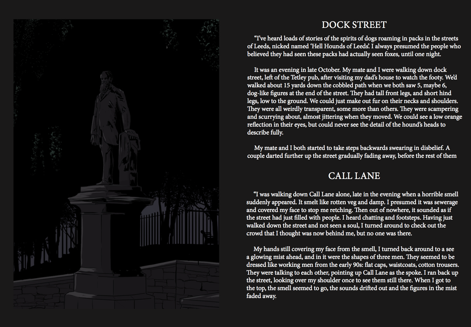
So originally the plan was to have an illustration on the left-hand side and the text (stories) on the right-hand page. like below

But it seemed too stiff, too symmetrical, that and when I applied the stories, they wouldn't fit. font size 12 was taking up too much room and I couldn't go smaller to fit all the stories on. so if I let the stories run on to another page that would let the stiff layout freer, it looked more pleasing. the issue with that was that in made it look like all the stories had random illustrations near them. so easily solved, every time we moved on to another location I put a title on the page, that and the location that suggests we've moved on is full page. like below

with that, I hit one more snag, the layout of the text was hard to arrange, the stories was different lengths and I didn't want to force weaker stories from my piles in there just to fill space. So I arranged the texts so there was space for a spot illustration. I am in love with a particular part of Mike Mignola craft. within his comics, he uses panels that focus on setting the scene it tells the reader what is in the seen of the characters he does this to help the reader see what it really like! I suppose it helps that situation more believable. So this was a good chance for me to use that also. a nice nod of the head to one of the legends...
So there are now spot illustrations that help with the atmosphere by an image of a moody sky with silhouettes of tree branches in the foreground. there are illustrations that show the reader items that would be on the scene, things like that...but all of them fit the rest of the moody and night shaded colours. to keep the flow! it's important to me that the book is never disconnected. examples below

it looks odd there as a screen shot but when it's read from the beginning it makes sense.
I had decided to have the publication split. One-half all the illustrations and text and the other half all the short comics. but when I laid that out the book seemed so heavy at the front and very intimidating with a great deal of text and the back seemed weak.
I decided to have a mix, illustrations followed by a comic, followed by more illustration and then another comic and so on! but introducing the comics from the locations was difficult. it seemed to just jump into comics, losing that flow and disconnecting from that dark and horror thing I was going for. It was suggested to me that I should give them their own page that introduces them as a separate story like the rest...
before the pages of the comic, Is always a location, the page after that turns to a blank spread, on the right-hand side is the title of the comic, and to keep it connected I took an image from the comic and layered it behind the text at a low opacity, low lighting feeling.

It doesn't sound so clever but attention to the things like low hue colours can make all the difference with drama and continuity in a publication. with the wrong decision, all it takes is one-page turn and the book will lose consistency...I'm no phycology expert but I used blank black pages In the attempt the reader will see it as darkness, hopefully, this far into the book they lost in this and see everything on the page as something scary in this case the dark.
close up

There are 50 pages of my publication, and it not finished yet. but I always knew that I was only submitting 5o and creating the rest for EOYS. The 50 I have so far the submission is almost done. I have to work on the text font, Some of the layouts and some of the tiles. but none of that can be done until the other 30 pages are complete. All that will be in a proposal at the end of this blog post.

I wanted to document the struggles, not in a negative way but just to document that this wasn't plain sailing making this publication-
Making the pages didn't go as smooth as it's portrayed above.
I hit a number of complications whilst making this book and had to either redo work or find a solution to get around the problem.
1. adobe InDesign latest update as come with some problems and it's apparently that it's complicating everyone's work who use it! the forums and feedback for adobe support team say they are aware and its being to be sorted very soon... It would crash every 40 to 50 mins of using InDesign. forever saving it having to redo what had not saved in between the saving it and it crashing. every time it crashed my computer had to be restarted.
things pop up with no text and no options...

it decided to delete my tool bar :)...oh how fun days before your deadline

whilst dealing with the program crashing and messing up my mac at 20 mins a time.
I was battling with the images and text in my publications when I saved it to a pdf file the colours would come out layered over each other. I googled why and I got support on the matter but we couldn't solve why it was doing in. the colours that I created in InDesign using the shape tool was saving a much higher richer of hue to the images that I created on photoshop and uploaded to InDesign -

the preview of this was solid black, I matched the CYMK and it still didn't work, and no one could understand it, so to solve this i had to delete all the black shapes I made in InDesign. and create a black page using photoshop to upload to my pages and use them as its background to make all the photoshop colours match.

then I had to orange all my layers so this new black background would fit, a tricky and long fiddly process, even more so when I knew I only had 40 mins a time to complete this task before InDesign said it had enough.


I hit a number of complications whilst making this book and had to either redo work or find a solution to get around the problem.
1. adobe InDesign latest update as come with some problems and it's apparently that it's complicating everyone's work who use it! the forums and feedback for adobe support team say they are aware and its being to be sorted very soon... It would crash every 40 to 50 mins of using InDesign. forever saving it having to redo what had not saved in between the saving it and it crashing. every time it crashed my computer had to be restarted.
things pop up with no text and no options...

it decided to delete my tool bar :)...oh how fun days before your deadline

whilst dealing with the program crashing and messing up my mac at 20 mins a time.
I was battling with the images and text in my publications when I saved it to a pdf file the colours would come out layered over each other. I googled why and I got support on the matter but we couldn't solve why it was doing in. the colours that I created in InDesign using the shape tool was saving a much higher richer of hue to the images that I created on photoshop and uploaded to InDesign -
the preview of this was solid black, I matched the CYMK and it still didn't work, and no one could understand it, so to solve this i had to delete all the black shapes I made in InDesign. and create a black page using photoshop to upload to my pages and use them as its background to make all the photoshop colours match.

then I had to orange all my layers so this new black background would fit, a tricky and long fiddly process, even more so when I knew I only had 40 mins a time to complete this task before InDesign said it had enough.


No comments:
Post a Comment