
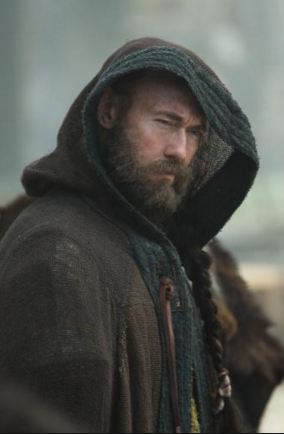
i have chosen to use the characters (below) to put into context. i will be applieing the character concepts into the pages of the comic books i am creating. the man is goig to be in the the comic book issue 1. and the creature is in comic book issue 2. both will be in the pitch.
iv done one coloured and one in black and grey to show the different options of the colour theme of the comic book that will be explained more in the pitch.


Narrative
my comic is intentionally based loosely on the song molten light.
however because my head is well over active i ended up with this all these scenes in my head. it still has has the same plot as the song but extended now. in the song at middle the brother go see the priest for guidance. mine will still have that scene but before that, the hole town are going to be tormented for a few days, and then when they town realise whats happening they offer a sacrifice and think its all over. but then one of the brothers sons get butched pretty bad and then they go see the viking priest for guidance. after that the main characters will be picked of by the creature but all dieing by horrible different deaths. in the song the creature just goes stright for the brothers and burns them. my story is more worthy of a comic book.
the pages ill be presenting will be 2 parts form the song but directed by me and translated by my influence no the song direction. and then 2 parts of my own created scenes that fit between the songs parts. (hope that all made sense because thats pretty important)
below story boards.
at first i dont put much detail in my drawings and i just use a simple grid layout to get the basics of the narrative down. later ill thumb nail some layouts.
below- this book is going to help me create the pages and everything involved in the pages of the comic book. iv read it before and using this to help guide the pages to the final development.
this book helps me with layout and speech bubbles and loads of other things such as drawing techniques, composition, inking and lettering, and its even got tips about breaking in - pitching to a publisher. all these ill be using in my project. a bit of a life save really.

my practice has a lot of freedom in it, i like getting a tooth brush and adding them textures or letting ink run. its a huge step from what i used to be drawing. in my personal sketch books iv been taking it that much further and smashing ink down. i wanted to have the balls to use that freedom in my comic. again its a huge step for me submit that style.
these are some of my private pages that will help me influence this free style comic book pages


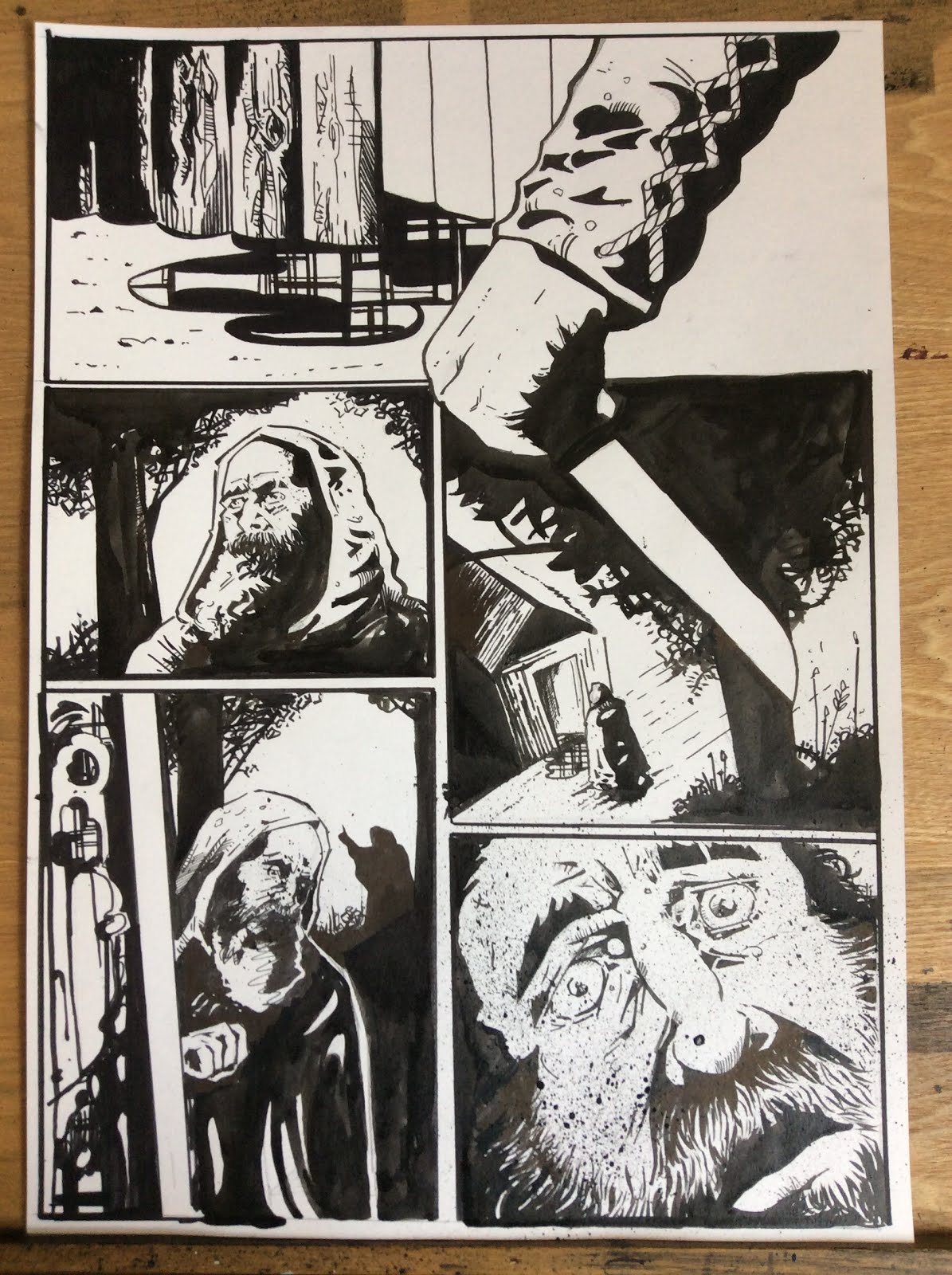
issue 2 page example 1
this page was exciting for me i used everything that i had learnt about pages from the book above. using over lapping images to tell the reader that the scenes are as a hole. changing frame composition to keep it interesting and enjoyable.

issue 2 page example 2
i was happy with the composition with the frame on this one this i could totally see on some horror film so this was an achievement for me. due to never drawing scary things and not having any knollege on creepy frames its difficult to portray that, i usually draw actions and stills.

issue 2 page example 3
i love the first frame in this page i think the flicks and splashes really give this image a movement, a tight jurked kind of movement. love it!

even though im super happy with the results i cant help of the pages and very happy with letting go and creating something so distant from my original professional practice...with all that it still wasn't hitting the spot for me, for me it didn't seam as professional as some of the art on the shelfs in town
(and there is some right crap on them shelfs)
i decided to take the images and run them through photo shop to give them crisp edges and any other way to make them more pro.
made the page black, levels was altered and still seemed so amateur.
just seems hobbyist

i added the one colour like my peers had suggested in a crit a few days ago, and i made the page white this time. i felt it looked more better because it was tightening up. the imagery was starting to tighten up.

feeling that the pages was looking better because they was becoming more tight i decided to carry on with the pages (some how with my brilliant computer skills i lost page 2 completely) yup they was getting tighter and now they was the imagery was being lost, the textures and the freedom was been trabslated as sloppy not artoistsic for me.

i decided to redraw my pages in the style i draw when i submit work for professional and college.
i was so much happier with the results, i could see the pages in an actual comic book and was happy to say that they are at the level i was hoping they would be.
i edited some of the frames and removed a few but got the story across either way.

i created example pages for issue 3 for my pitch.
again real happy with the results.
i think the frame work that i learnt from the book is paying of and show in these pages. i leant that useing a grid page basically is the same as an action part in a film were the frames are looking at one thing but from different angles and giving fast and important information. i tried that here (PAGE 2)and i think it worked apart from one frame that does not need to be in int and thats the 5th frame, it shows a limb bursting from the body and the 6th frame is the limb having a now stood up...i could have removed the 5th frame and the same story would have been told.
apart from that im happy.


in my pitch is going to be 3 examples of issues. each with 2 pages in, and each with an issue cover.
a little lost as what i should put on my comic cover. it needs to be tempting to buy and needs to have to illustrate horror but i dont want to reveal the monster on the cover.. i dont want to give too much away but for the sake of getting attention a little bit of the monster would be okay on the cover but not loads.
i researched film horror covers and these are the top 8 that i saw and thought i could use them as starting points for my cover. each one transformed the location into a viking area and the victims as the characters from my comic and the creatures being swapped as my scary lady.


i researched comic book covers also, but i have to admit nope of them i saw wasnt doing anything for me, seeings the creatures first gave away too much. the art work wasn't selling it for me either. a few examples that might influence my work (best of a bad bunch)


font downloads for the cover title.
revenant-


i coloured the comic pages in using a grey scale. i felt that colour would distract the story telling, i wanted it to feel dark and scary. less there is the more the imagination of the veiwer is used.


im really happy with the coloured result but for some reason im in love with it been black and white.
so i did some research and found a strong successful horror comic that was published just in black and white. and has got a huge following all over the world.
the walking dead.

so with in my proposal i will submit 2 variant styles of the comic. grey scale and black and white.
revenant issue number 1


revenant issue number 1


revenant issue number 2


