Monday, 21 December 2015

Responsive- spectrum development


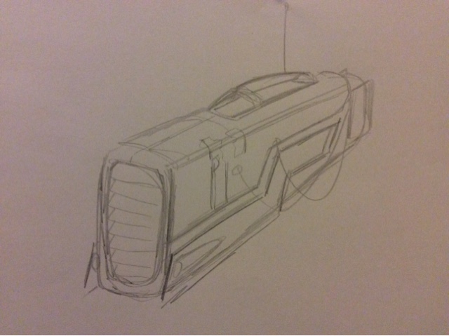
i drew out the speeder and put it in a location that dosnt need much work, i introduced a character to the image just to set the scene. i then put the image into photoshop to experiment with colouring. not the colours of the object but i want to test out a basic colour nethod iv been working out in my head. im thinking what ever colour i put donwn i should use one base colour and one shadow and one highlight for each base colour. i feel that detailed digital paint dosnt fit my stle of inking, and my knollage on digital colour isnt strong enough, people say its the same colour as it is in real life but for somreason i pick the wrong colours, allways slightly of. i like to feel the thickness of paint mixing and seeing the colour right there in front of me...but ill get used to it soon. 

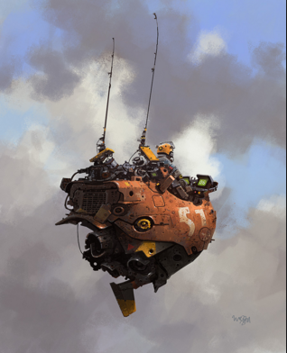
this is a screen shot from the final image on photoshop. im well happy with my little self with this, not because it looks good or anything but because i feel like iv taken another step forward with my digital skills. i learn loads whilst working on this i learnt new layer skills and how to blend a colour like in the clouds. 

remember this was a experiment this isnt a final image so theres some details missing like work on his shoes and what have you so if it looks funny its because of that this was an experiment on colour so im not judging this piece on the detail or the craft of the image but the colour... i think the colour is to bright, looks very amateur...even though i am amiture i think its good that i am identifying that things arnt looking as well as they can be. 
on the other hand it could work because of the location, being in a bright desert will brighten the pigment with in clothing and materials.

iv been a fan of jared muralt for some years now but his work has never influenced my practice i can across the picture below on instagram and it got me thinking how i could incorporate this into my
work, it might make the feeling of a lost world more believable. also it was a chance to see how my work would look with out that heavy line abuse.


my work has a strong outline i like the heavyness to fall on the page and to feal strong when it comes to drawing with ink or that comic style i go for.

i think the experiment worked well. i think have one base colour and one shadow and one high light worked. if i was to paint this i would have many colours with in the shadows to give it depth and there would be 3 colours of highlights then topped with a white ink to make it pop. but here it dosn't need that i think leaving limited colours lets the ink do more work on the page. i like that! 

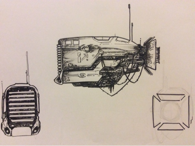
below is the prime example of this. check the crap hung on the speeder. the engine thing that is netted up...the blue thing. has one bas colour one shadow colour and one high light colour. 
but not everthing has a highlight. the seat dosnt have a high light and it still works there. the rule is that i can have no more than 3 hues of colour on an element of the picture.


with this been the first image that has most the elemnts on the picture i thought this would be a good idea to experiment with the composition of it. the final image had a lot of sky on the page i wanted to see if the image worked better cropped down. i thought it might bring more focus on the image it self.
i think it works better for this image and it dose but it needs more location to express a dead world not some treasure hunter in desert. this isnt what my final image will look like but if i crit the image as if it was il have more ammunition to execute a final image.
the image isnt too bright i think the hue is too strong, like pop art strong. so im going to play around the colours in photoshop.

i was going to play around with each layer and select eatch colour with my magic wand repaint a softer duller colour but georgie explained that i can edit the hole image by using levels but changing the saturation hue and darkness...what a life saver.


this is more like it, the colour isnt as strong and the dullness makes the atmosphere more believable. i cant explaine why but this is better. 

Thursday, 17 December 2015

final piece development


some examples of the finished ink drawinsg.


here are few examples of the mono that iv been working from to adapt to my inked city drawings. iv not been useing them as a full page iv been using them almost like a jigsaw. taking parts from different pages some just center meters long and some half pages. almost like building lego. some of the finished piece has had over 60 layers on.


a couple finished results from using this method.
this one i think im going to print out like this and get some chalk texture in them buildings to make them come to life.


i love this one. this was one of he images with 10s of layers. was tricky and hard. most of the textures was cought by using parts of the mono prints that was just cms wide and high. and with a little high lights here and there i realy thing it makes it look night.


the hardest part of doing these was making the images look deep making the images  have depth. to do so i was layering up the mono on a multiple layer and changing the transparency. and then it felt unachieved, i think its worked on the above picture well and maybe a couple more. but some havnt come out as well so i plan to print them out and work on the actual image by putting prints in them. maybe rubbings with chalk.

i went from the idea of having a concertina book to a saddle stitch book full of locations of leeds. but now i think thats a naff idea that is boring...i would pick that up in a shop. so my new idea is to go back to the concertina with the locations in but instead of having them flowing the images will be separted by elements of the ruined city, such as over grown plantation, rubbled houses, burnt out cars and some iconic things from the city like the uni clock and the owls.

i feel this idea is a much stronger idea i feel it shows exacly what iv been try to express about my author. i want the images to set the mood and state of the location as one, i want the location to be the most importent thing of it all, i want the different elements to show different situations of survival..urbon, woodland, cold, hot, night day. i want the owls and the iconic places to represent posestion. i want narative to my publication, so the image i did for my screen print will be added to the last page, so the vewier who has gone through this hell hole will see them and hopfully will understand that the characters are surviving in this situation and hopfully say i wouldnt want to be them or even feel sympathy

because im not doing a book and now im doing a concertina the pages wont flow through and i want the book to open up and make one long story...one long image. so im creating new pages that will make all the images blend im going to use the iconic places and thing from leeds to sepurate the city images and use them to blend them. some pages will just explain the land as it is in the book but others will be there to describe leeds like the owls or the clocks.

but because iv all ready got 6 drawings done i have to work on my placement as i go along...so i draw a picture then stick it in my indesign file then i have to draw a picture that will go between two and make them flow. ill have to do this though out, its not harder or compacted at all just another way of making it but if this was my idea from the get go i would have designed all the drawings in my sketch book before make the final images. pffft who wants an easy life anyway.

these are a couple of that iv been working on to make 2 images flow. a lot of work to make this happen but it will be worth it and hopfully will look good.


       i took images from my sketchbooks and scanned them into photoshop and layered up the mono prints like i have done for all my other images 


when i put the images to gether on in design i get to see the structure and i can use my imagination and see what the final thing will look like. at this stage its a lot of playing around finding what images work by sde of eatch other but like i said im working on the hole thing as i go along. the book will be approximately 20 pages long witch will work out at 2m long at eatch page been 20cm long when i have all the images in the place i want them and i feel i can make it murge and flow i will put the hole file into photoshop and added more textures that will run through out and add little more things to make the pages flow side by side.

below you can see the pages im working, left is the age i created to help images flow and right was the city scene iv all ready created you can clearly see the center step between eatch picture this is what i will be editing when i put the hole image through photoshop at the end. add more trees or urbon waste land.


because im trying to make the mages fit i cant really work from storyboards.its a procedure of trail and error, having an idea there and then and making the images fit and building layers of print up to make the image and to make them seem as one.

below finished image.


above is a closer look at the images that iv been working on, 3 images that iv made blend through to make one image i think its pretty convinsing. the only problem is the line running through the arena. thats a street light and from this size it stops the flow of the image. but on a biger scale its not there.

so far im really happy with the publication. this is my first concertina. getting the right measurement for the pages to fit the canvas size was challenging. im hapy with the practical work init. im also pleased that i got across the feelings and the points from mcarthys work that i chose to focus on. i think the ocation and the state of it sets the seen and is importent to the image.

final publication


im really pleased with my publication. im happy with the level of craft that has gone into it. even thought its still a little rough around the edges this is the most pro iv had something looking. useing mono print for textures and tones has been really exciting, this is the first time iv ever created an image using something other than the basic hand tools, such as pencil, paint digital and what have you.

the procedure of making this was exciting. it was nice to sit down with a flat ink image and make it have depth, and give it age and a tone by using only mono print texture. its been nice to be able to create a piece that has been so far away from my comfort zone.

  the only down fall to this was the cast. when im creating something i always keep in mind a price...i think how much i would pay for something and use that as my target. so for e.g if im doing a painting of a frog, i would pay more than 35 quid for a painting of a frog... this publication cost me 16 quid to make. so if i was to sell this and get profit, i would have to sell it at £16.1p. i would pay that much for this. so next time im making a publication i will think other ways to create it at a high quality but much cheeper.

Wednesday, 9 December 2015

Responsive- spectrum development


i did what i said i would do, i took the original source and slowly pushed the basics forward to a point that triggers of or inspires a me to evolve it to the way i imagine.


here i started to play scale and movement. iv gone for a more heavy look with it a more of a heavy goods transport thans a speeder. 


here i started to realy get into it, i started to think how this would be if it was real i started asking questions like how big is it? how fast does it move? were is the cock pitt? how do you enter and exit the ship?


now im ready to start making this evolve. im now real inspired to create a chunky cargo skind of ship. all the other images have been roughs so now i want to take the time and get a solid look of what it is im creating. and then ill go bacj to roughs and do the same things again almost like a check point were i take a look back and see what it looks like and what not.


so far im happy. i recognise that its not finished and there s long way to go but im happy, i have faith. it dosnt exactly say "i live in a barren wast land" so thats down to colour and textures of the vehicle. i didnt want to cary on making thumb nails and rough ideas with out having some idea of the textures and colours.

so i scanned it in and put them threw digital.
   

i was around 10% into starting the colouring and someone told me it look like the source (the lego) i did want it to suggest the source but not to be that recognisable, i explained that the size is greater than the original source but they basically said that its too much. i like it when people give me honest feed back it helps progression...but still i was a little gutted because i was felling this one. so i decided to quit what i was doing and went back to the drawing board.


above:- these two i took it back to the speeder shape just like the original source. i wanted to play around with the shape some, i still wanted that block shape and rough edges because i think smoother gives of the wrong message it dosnt say barren at all it says smooth future sailing.

below:- okay i had a play with the speeder shape again and didnt like it i was really happy with a hippo of a ship. i played around with the sape and tried to make it more solid and give it more of a heavy look again i was super happy with the results so to test it i drew it again but in is Context to try and show the size of it. i showed it to the person who gave me the feed back before and his time they was happy they explained that you can see the lego init but this looks more like a original concept.


again i played with size and environment. i want to see what suits it best. a 1 man cargo ship? or a more of a multipul man operational ship? i think they both work but as long as the enviroment is right for each of the ideas.

below: 
i thought i would mess around with the size of it again and make it smaller more like a speeder. i didnt feel like the process stage was finished and explored enough to move on to somthing else.

i looked through my drafts and body of concept i had all ready created and took some of the information and went back to the original source. and started a new journey.


i liked the speeder feel because its more a personal item and in the situation im going for i think possessions would be the most important
.

at this stage im wondering what scale would this speeder be compared to a man. i want it to be almost clumsy looking but reliable. like one of them trike bike.


heres some side shots of it. so the world is over the population are relying on scrap metrials as trade. so when one area has been luted they need to move on, so this speeder needs to have to have belongings on it and a place to store scrap for trade?

so my next ideas are experimenting with that.


i love this idea, i think it looks practitcal and what you would expect to see in the situation as i have described in above, no posh little compartments you would be rushing and packing thing ontop of each other to get to your next loot before someone else got there.


gave it some shading to get an understanding of the form of the speeder. regestering were light would hit and reflect on the speeder.


the colour of the speeder. i want it weathered but with some history of a colour there or some pattern.
i didnt put the colour on it just yet i wanted a basics understanding of the colour.

the speeder will hover, there will be no legs or purches on this. becaue everything in the future floats right?


Responsive- spectrum development


so im at the point of creating a body of work that i can use to build one of my final pieces.

description of an idea that i have in my head that i want  to work on.

based in a barren waste land. a world of scavenging and trading materials to survive. its based in the future. the land is sand and dust. its of world..so not earth. there will be future transport and characters that will explain the environment.

i had to gather a few images that can support my idea and that i can use as reference. i didn't want to collect a huge amount of images because i feel that would influence my idea.

with these images i can be influenced with my pallet. i dont think i will be creating a digital painting like this but it will be digitally coloured so i can defo use these images to support and aide me.


when i collect images to suport my work i always try to find the one image hat will sum up what it it is that im working for. and the next image just does that. this is the feeling im going for and the world type. and even the colours are what i imagine mine to be like. 


id like to keep my dignity and say i stumbled across this image but i didnt i actuily made the effort to go out and buy this. for research purposes of course. when i look at this i think that he transport that im thinking about creating for my image could be inspired by this. not to create somthing that looks like this but a starting point. 
  

some more images iv collected to help me capturing the feeling and atmosphere of a barren world im looking for.


i want to add some todays transports also for a little inspiration.